Research-Led Decisions
Layouts and flows justified by user behavior and business goals, not trends.





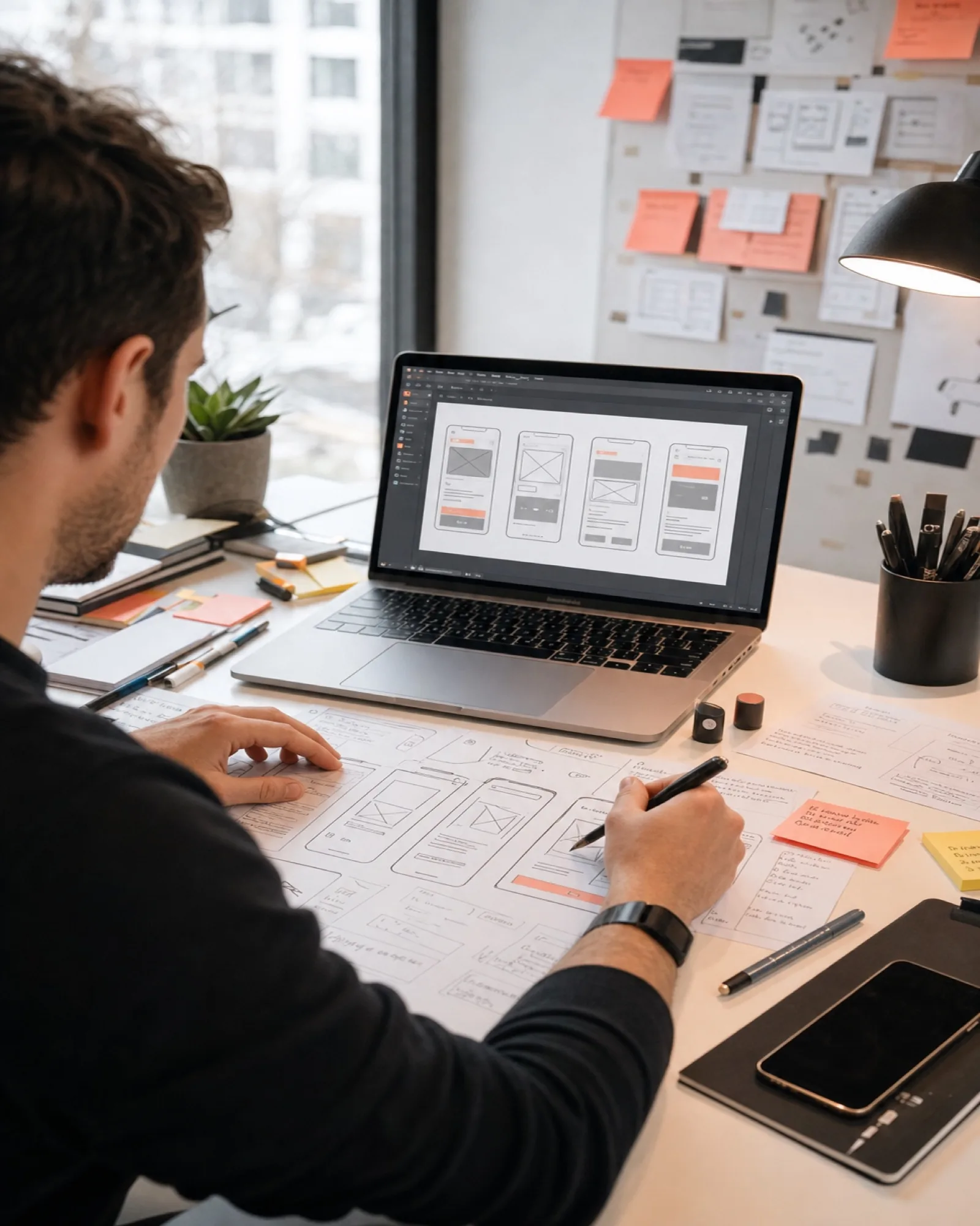
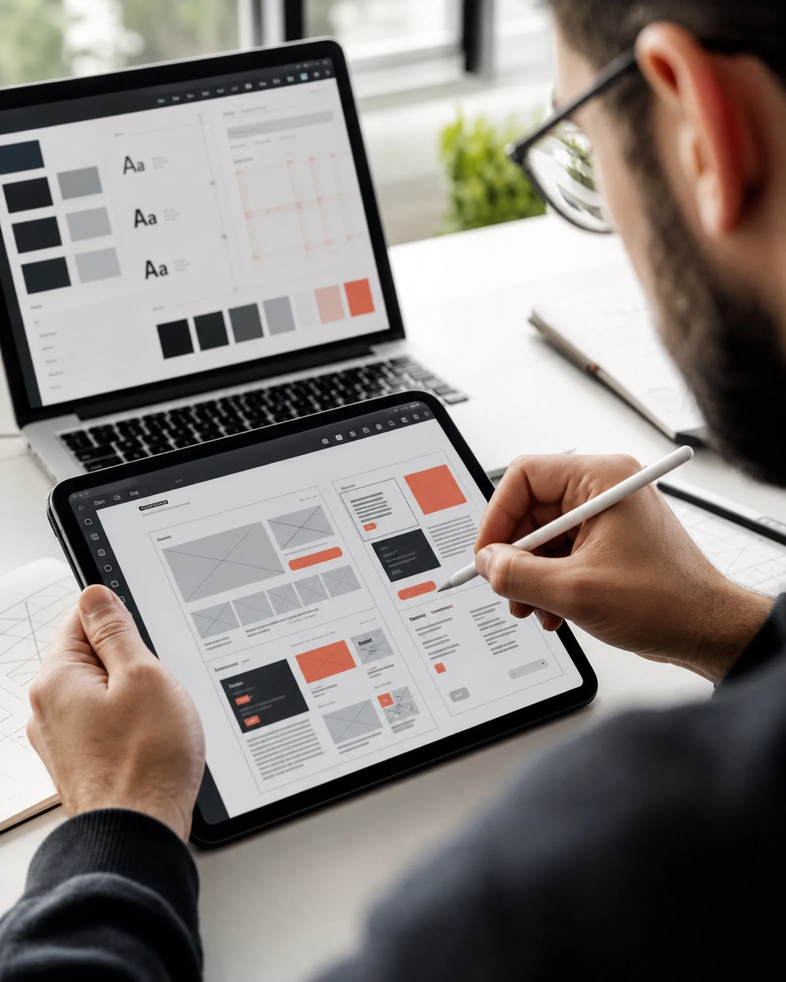


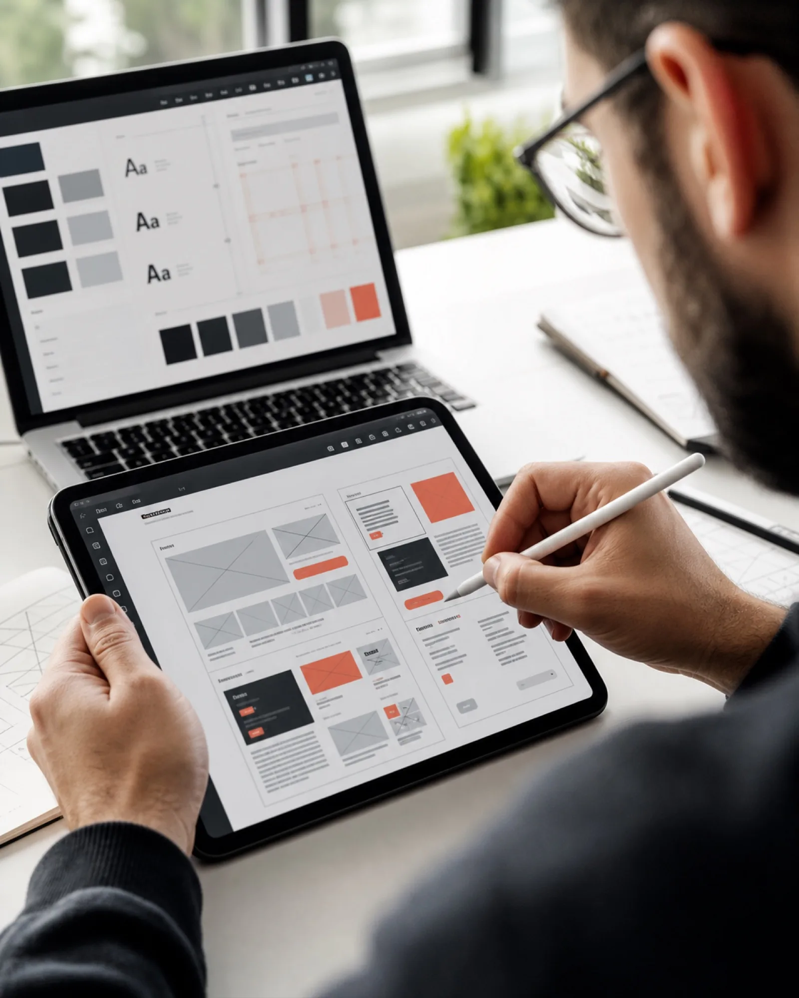
We don't design from taste alone. Every interface starts with understanding who uses it and what they're trying to achieve — then we design the shortest honest path to that goal, in a component system your developers can build without guesswork.

Layouts and flows justified by user behavior and business goals, not trends.

Component-based Figma files with specs that translate directly into code.


Designers who work beside the developers building their screens — feedback loops in hours, not weeks.
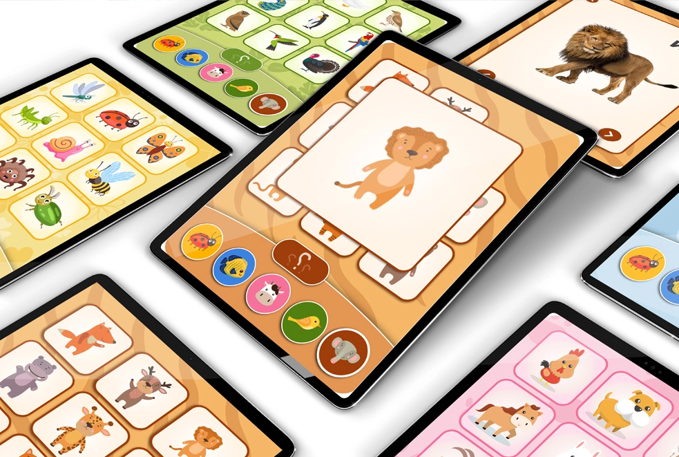
Todly, an edtech platform for children, needed an interface that worked for two very different audiences — kids and their parents. We designed a playful, intuitive experience with the structure parents expect.
Read Full Case Study
Information architecture and low-fidelity layouts nail the logic before the polish.

Pixel-accurate UI in Figma, on a reusable component system matched to your brand.
Understanding your users and mapping the paths they take through your product.
Every screen and state designed in high fidelity, not just the happy path.
Reusable Figma components with variants for consistent scaling.
Layouts specified for desktop, tablet and mobile breakpoints.
A clickable version of the product to validate before development.
Precise specs, assets and annotations your build team can implement directly.
We review the implemented UI against the designs before launch.
UI matched to your existing brand, or a fresh visual direction if needed.
Focused design engagement for a single product area or site.
End-to-end design from research and wireframes to tested, developer-ready UI.
Common questions about our ui/ux design service.
Yes — responsive web platforms, iOS/Android apps and e-commerce stores. Our portfolio spans healthcare, edtech and retail products across all three.
Absolutely. We design within your established brand, or help evolve it if the current identity doesn't translate well to digital product UI.
A complete Figma workspace: user flows, all screen designs, a component library, an interactive prototype, and developer handoff specs — everything needed to build without guessing.
Yes, and it's our most common engagement — design and development under one roof means nothing is lost in translation, and the designers QA the implemented product.
Get valuable consultation from our professionals to discuss your project. We are here to help you with all of your queries.