Mobile-First Development
We design and build for small screens first, then progressively enhance the experience for tablets and desktops, so nothing feels like an afterthought on mobile.





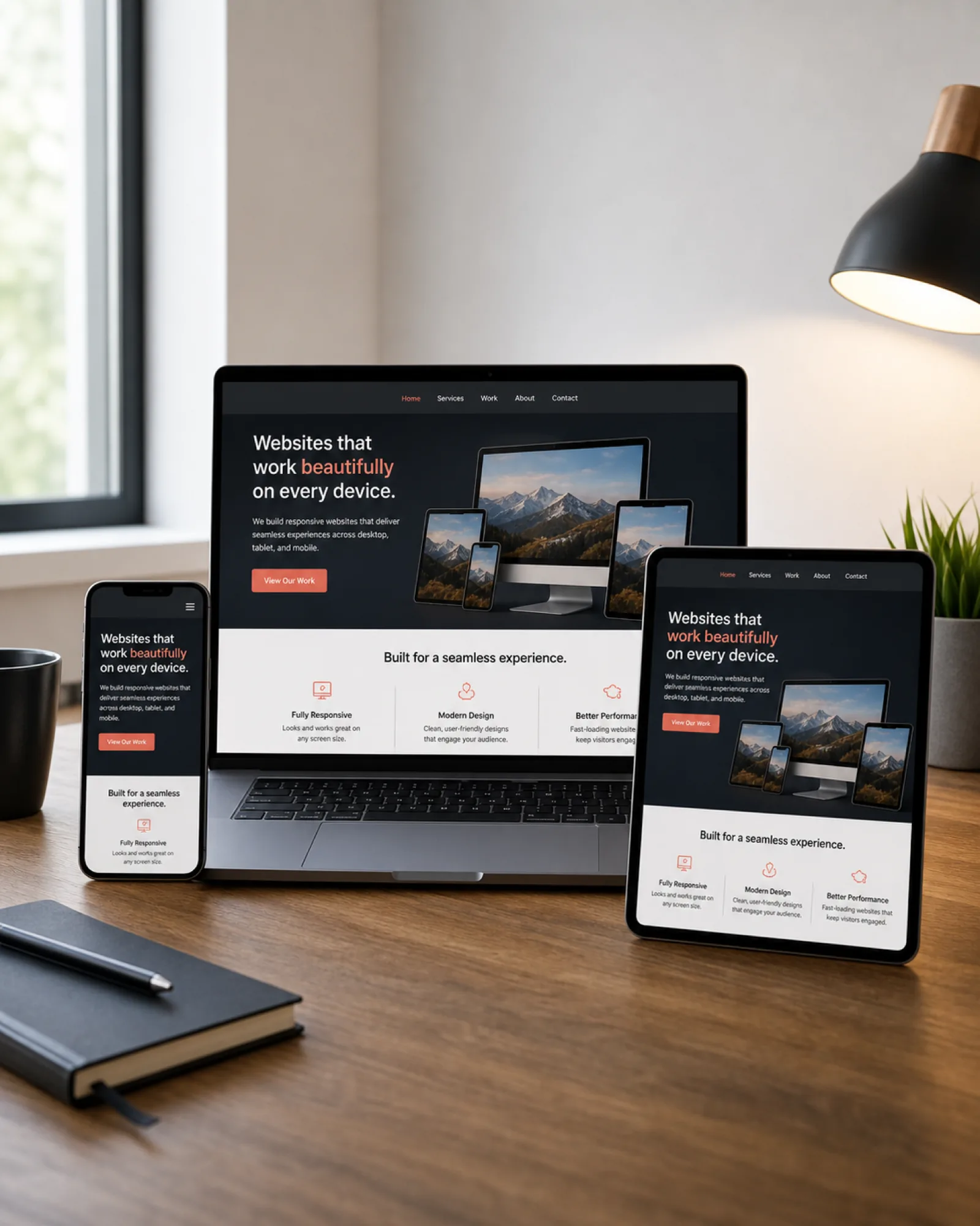
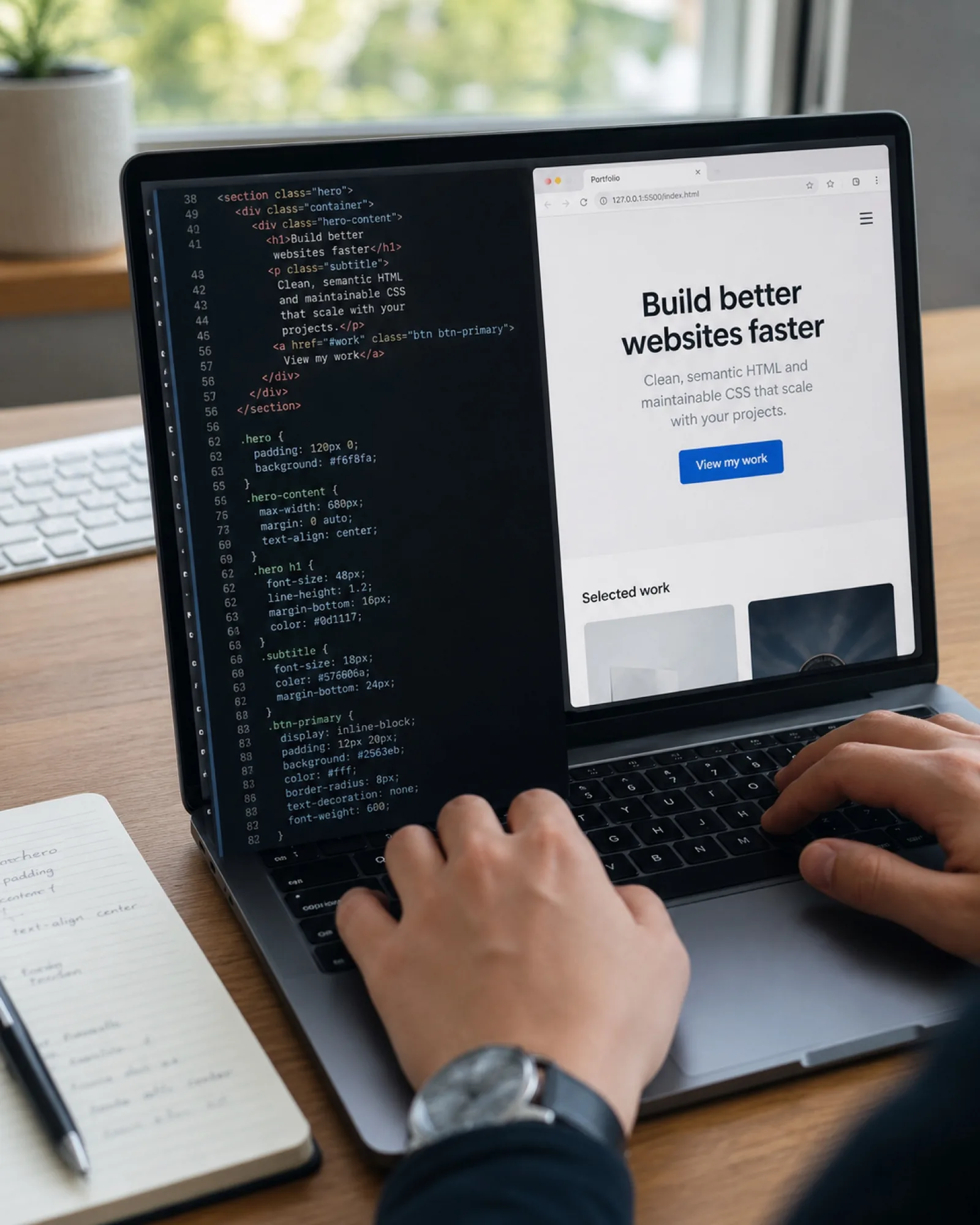
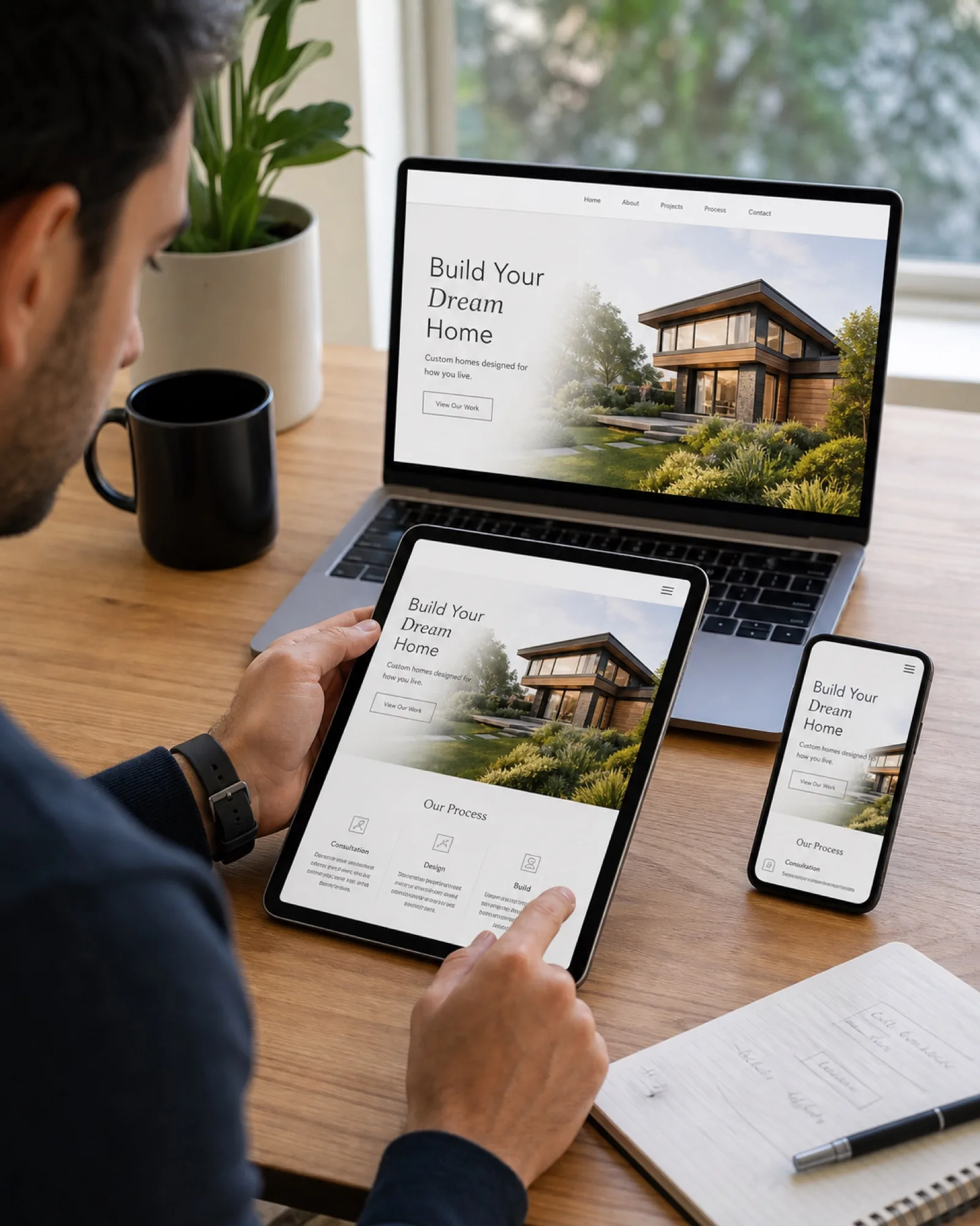
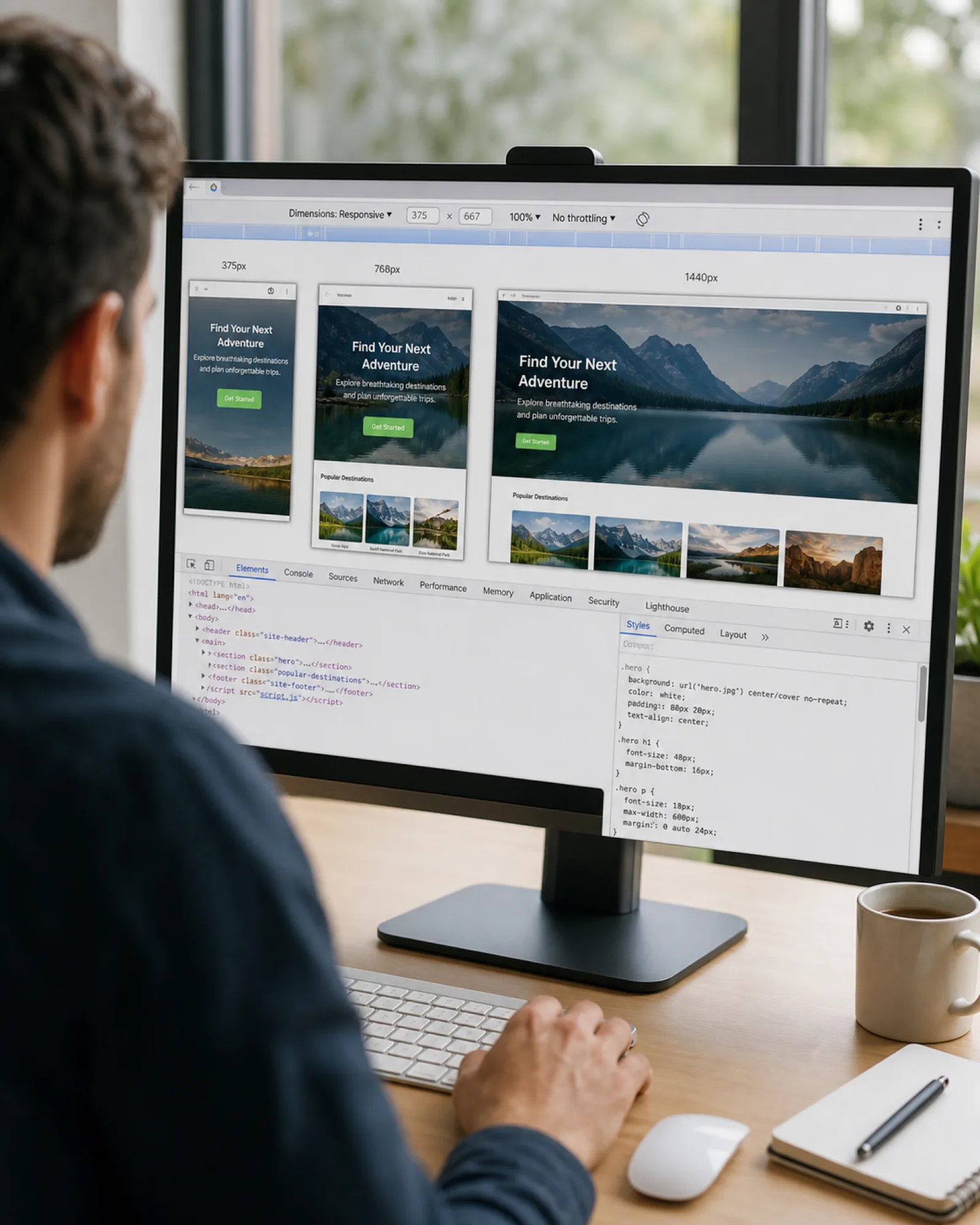
A responsive website isn't just a design that shrinks to fit — it's a single codebase that reflows layouts, resizes images and adjusts navigation for the device in front of your visitor. We build every site mobile-first, then scale up, so performance and usability never suffer at any breakpoint.

We design and build for small screens first, then progressively enhance the experience for tablets and desktops, so nothing feels like an afterthought on mobile.

Clean, semantic markup and optimized assets keep load times low and search engines happy, since Google ranks mobile page speed directly.

Every layout is built on flexible grids and relative units, so your site reflows cleanly across phones, tablets, laptops and large monitors without breaking.

We serve right-sized, compressed images per device, cutting load times on mobile networks where every second of delay costs conversions.

Buttons, forms and navigation are sized and spaced for real thumbs, not just mouse pointers, so mobile visitors can actually use your site.

We test every build across real devices and browsers, not just emulators, before it ships, so what you approve is what customers see.
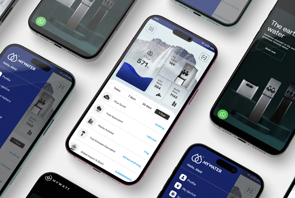
MyWater Pakistan's site adapts fluidly from mobile dispenser-control screens to full desktop dashboards, with responsive layouts that keep the AI-powered purification story clear on any device.
Read Full Case Study

We map your key content and user flows first, deciding what matters most at each breakpoint before a single pixel is designed.

Wireframes and visual design start at the smallest screen size, ensuring the core experience is solid before we scale up.

We develop with modern CSS Grid and Flexbox breakpoints, testing continuously as we build rather than retrofitting responsiveness at the end.
Before launch, we test on actual phones, tablets and desktops across major browsers to catch issues emulators miss.
Built and tested from small screens up, so mobile isn't an afterthought bolted onto a desktop design.
Layouts and media that adapt smoothly to any screen size, not just a few fixed breakpoints.
Navigation, buttons and forms sized and spaced for real touch input, not a shrunk-down desktop layout.
Images and scripts tuned for fast mobile page speed, where slow connections are common.
Tested across major browsers and real devices before launch, not just one simulator.
Every major screen size checked — phone, tablet and desktop — not just the two extremes.
Semantic HTML and readable contrast, so the site works for more of your visitors.
Covered if a new device or browser update causes a layout issue after launch.
Small business and marketing sites with a handful of pages.
Larger, fully custom responsive builds with more content and functionality.
Common questions about responsive design, mobile SEO and rebuilding an existing site.
A mobile-friendly site is often a scaled-down version of the desktop site. A responsive site uses one flexible codebase that adapts its layout, images and navigation to any screen size. We build responsive by default since it's better for SEO, maintenance and user experience.
Yes, positively. Google uses mobile-first indexing, meaning it primarily evaluates your site's mobile version for ranking. A properly responsive site with fast mobile load times is a direct ranking advantage.
Most responsive website projects take 4-8 weeks depending on page count, custom functionality and content readiness. We'll give you a firm timeline after scoping your specific requirements.
Sometimes. If your current site's structure and codebase support it, we can retrofit responsive breakpoints. For older or heavily customized sites, a rebuild is often faster and more reliable than patching — we'll assess and recommend honestly.
Get valuable consultation from our professionals to discuss your project. We are here to help you with all of your queries.